How families in one country spent their weekly income
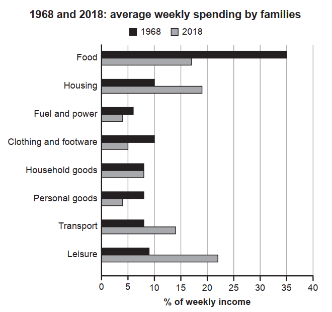
The chart below gives information about how families in one country spent their weekly income in 1968 and in 2018.
The chart below gives information about how families in one country spent their weekly income in 1968 and in 2018.
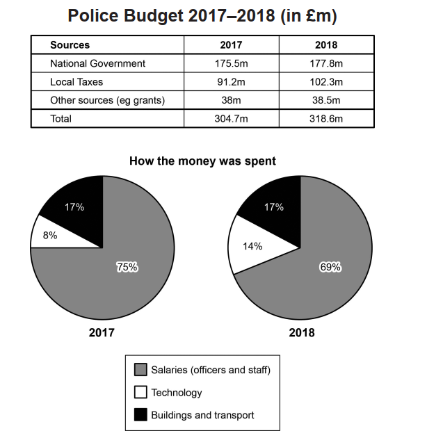
The table and charts below give information on the police budget for 2017 and 2018 in one area of Britain. The table shows where the money came from and the charts show how it was distributed.

The maps below show an industrial area in the town of Norbiton, and planned future development of the site.
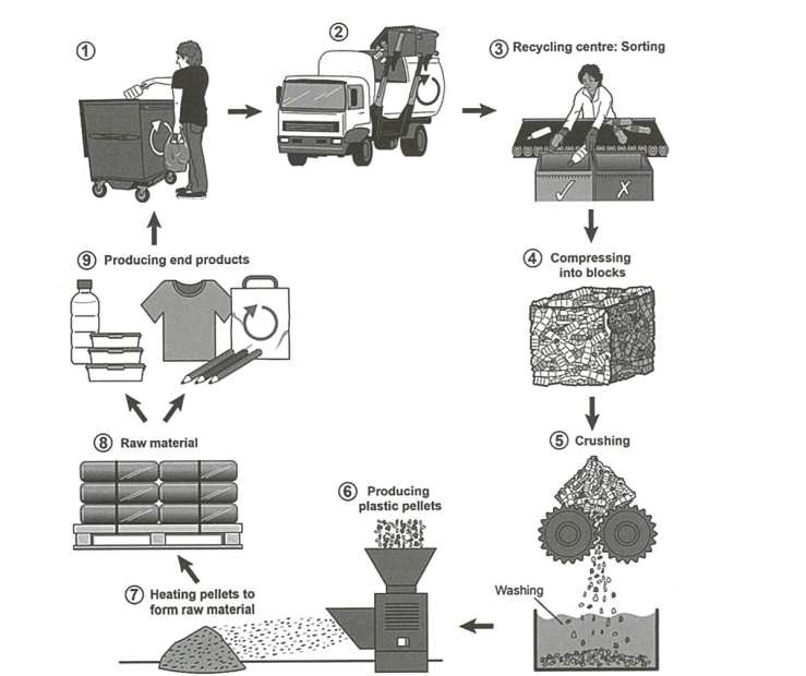
The diagram below shows the process for recycling plastic bottles.
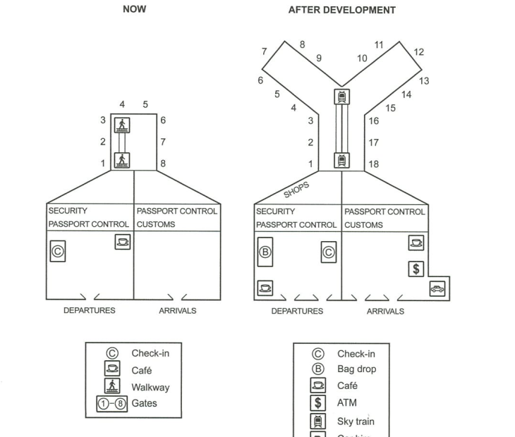
The plans below show the site of an airport now and how it will look after redevelopment next year.

The diagram below shows the manufacturing process for making sugar from sugar cane.
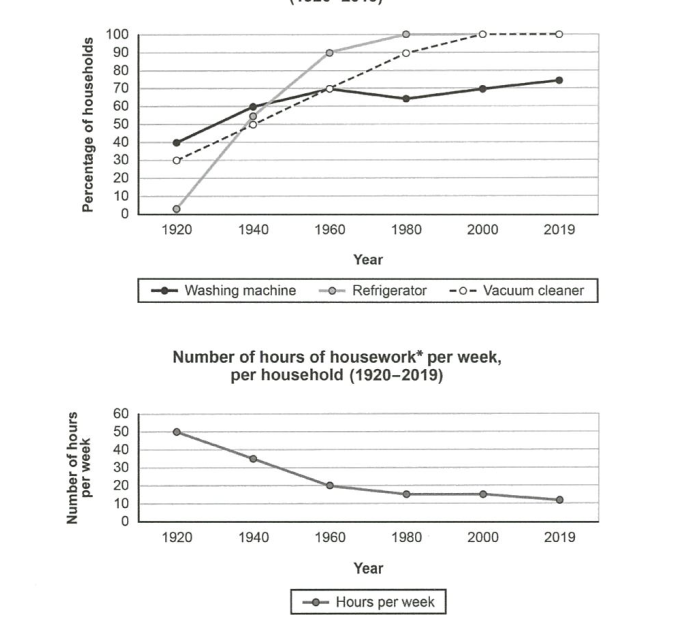
The charts below show the changes in ownership of electrical appliances and amount of time spent doing housework in households in one country between 1920 and 2019.
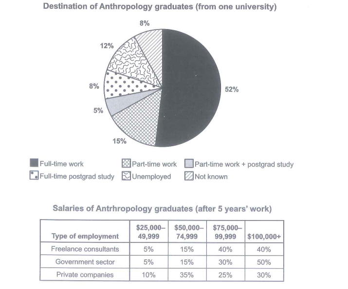
The chart below shows what Anthropology graduates from one university did after finishing their undergraduate degree course. The table shows the salaries of the anthropologists in work after five years.

The diagram below shows how instant noodles are manufactured.

The graph below show the number of tourists visiting a particular Caribbean island between 2010 and 2017.