
The number of households in the US by their annual income
The chart below shows the number of households in the US by their annual income in 2007, 2011 and 2015.
The chart below shows the number of households in the US by their annual income in 2007, 2011 and 2015.
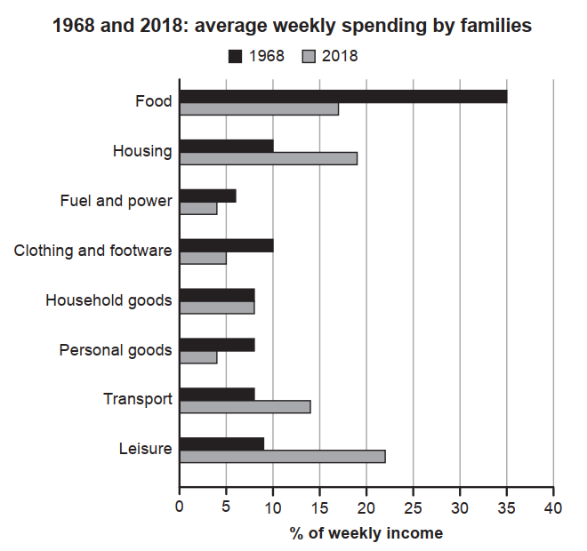
The chart below gives information about how families in one country spent their weekly income in 1968 and in 2018.
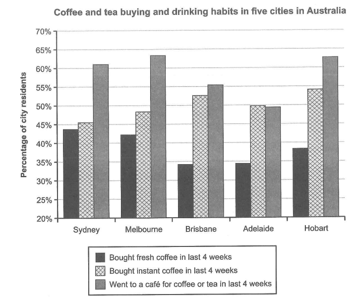
The chart below shows the results of a survey about people’s coffee and tea buying and drinking habits in five Australian cities.

The bar chart below shows the top ten countries for the production and consumption of electricity in 2014.
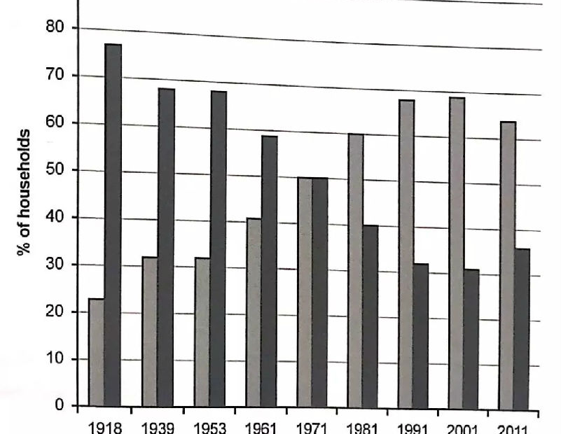
The chart beiow shows the percentage of households in owned and rented accommodation in England and Wales between 1918 and 2011.
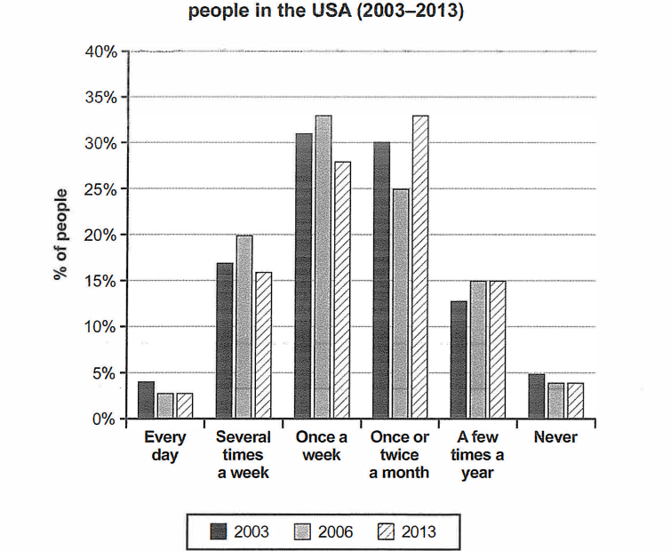
The chart below shows how frequently people in the USA ate in fast food restaurants between 2003 and 2013.
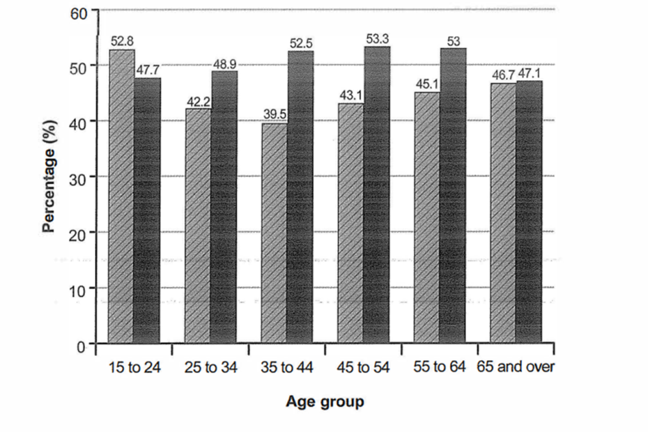
The bar chart below shows the percentage of Australian men and women in different age groups who did regular physical activity in 2010.
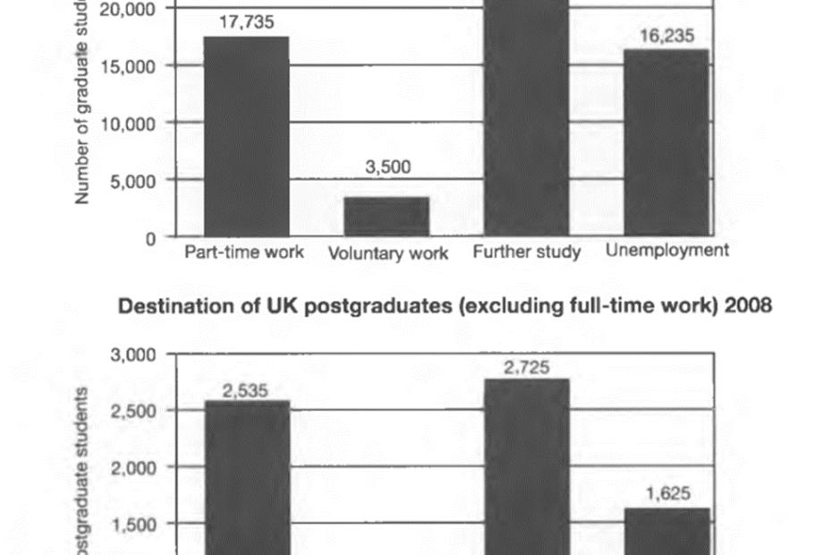
The charts below show what UK graduate and postgraduate students who did not go into full-time work did after leaving college in 2008.
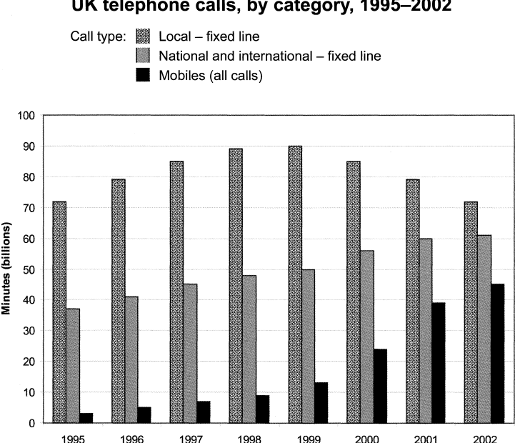
The chart below shows the total number of minutes (in billions) of telephone calls in the UK, divided into three categories, from 1995-2002.

The chart below shows information about changes in average house prices in five different cities between 1990 and 2002 compared with the average house prices in 1989.