
The average monthly change in the prices of three metals
The graph below shows the average monthly change in the prices of three metals during 2004.
The graph below shows the average monthly change in the prices of three metals during 2004.

The graph below gives information about the percentage of the population in four Asian countries living in cities from 1970 to 2020, with predictions for 2030 and 2040.

The graph below shows the number of shops that closed and the number of new shops that opened in one country between 2011 and 2018.

The graph below show the number of tourists visiting a particular Caribbean island between 2010 and 2017.
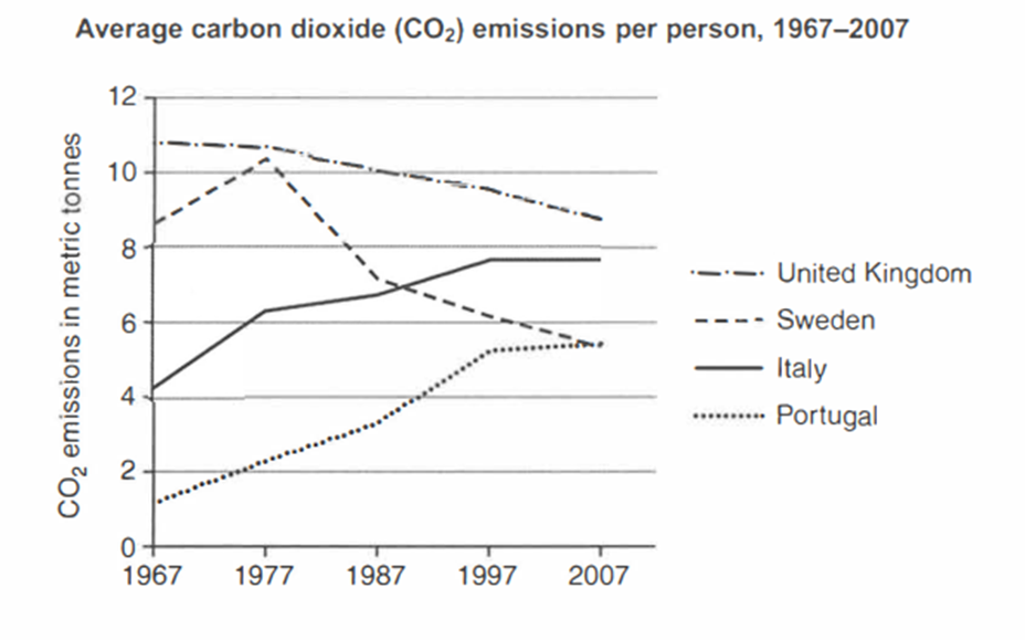
The graph below shows average carbon dioxide (CO2) emissions per person in the United Kingdom, Sweden, Italy and Portugal between 1967 and 2007.
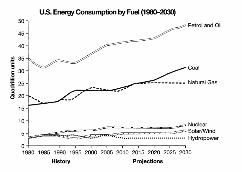
The graph below gives information from a 2008 report about consumption of energy in the USA since 1980 with projections until 2030.
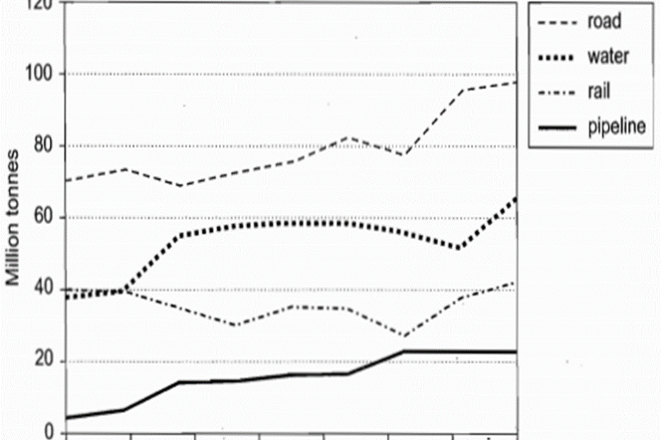
The graph below shows the quantities of goods transported in the UK between 1974 and 2002 by four different modes of transport.

The graph below shows the consumption of fish and some different kinds of meat in a European country between 1979 and 2004.

The graph below shows the proportion of population aged 65 and over between 1940 and 2040 in three different countries.