The average percentages in typical meals of three types of nutrients
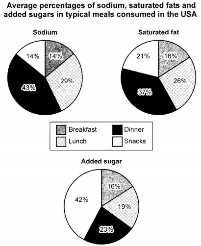
The charts below show the average percentages in typical meals of three types of nutrients, all of which may be unhealthy if eaten too much.
The charts below show the average percentages in typical meals of three types of nutrients, all of which may be unhealthy if eaten too much.

The charts below show the proportions of British students at one university in England who were able to speak other languages in addition to English, in 2000 and 2010.
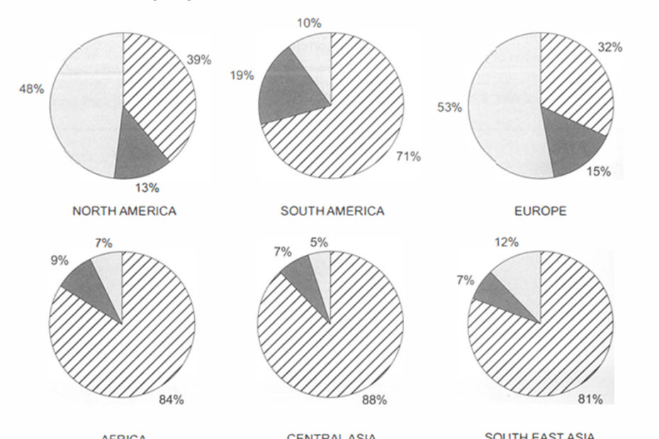
The charts below show the percentage of water used for different purposes in six areas of the world.
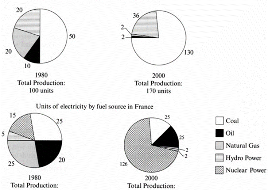
The pie charts below show units of electricity production by fuel source in Australia and France in 1980 and 2000.

The three pie charts below show the changes in annual spending by a particular UK school in 1981, 1991 and 2001.
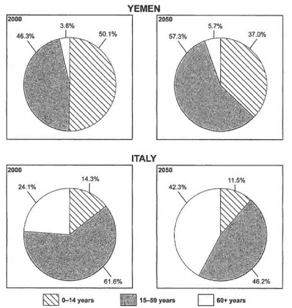
The charts below give information on the ages of the populations of Yemen and Italy in 2000 and projections for 2050.