
The layout of a university’s sports centre
The plans below show the layout of a university’s sports centre now, and how it will look after redevelopment.
The plans below show the layout of a university’s sports centre now, and how it will look after redevelopment.

The bar chart below shows the top ten countries for the production and consumption of electricity in 2014.
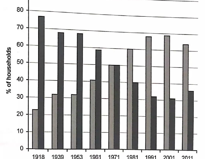
The chart beiow shows the percentage of households in owned and rented accommodation in England and Wales between 1918 and 2011.
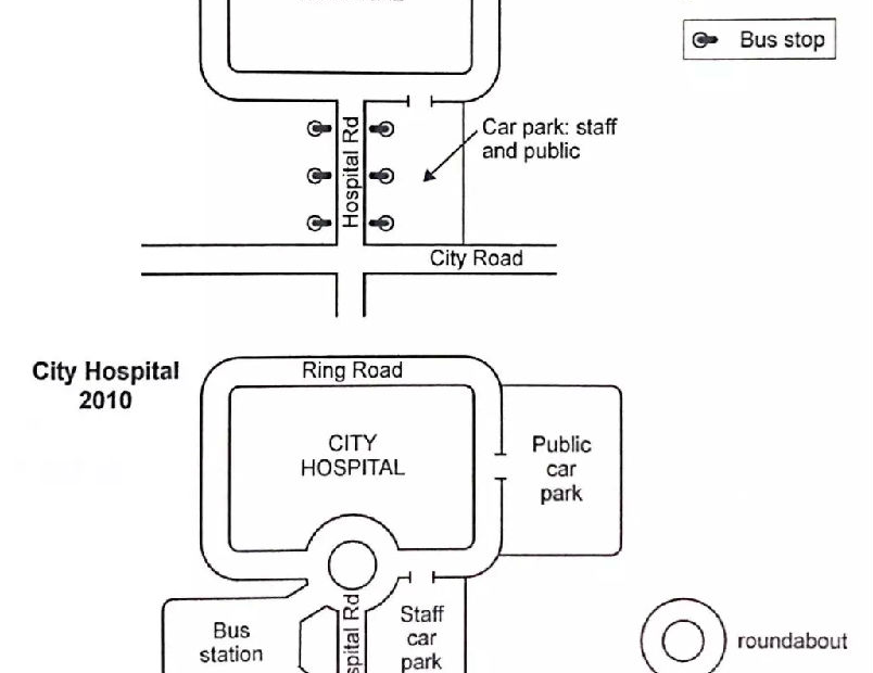
The two maps below show road access to a city hospital in 2007 and in 2010.
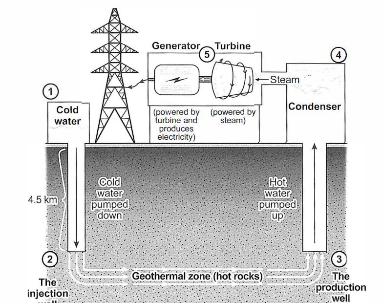
The diagram below shows how geothermal energy is used to produce electricity.
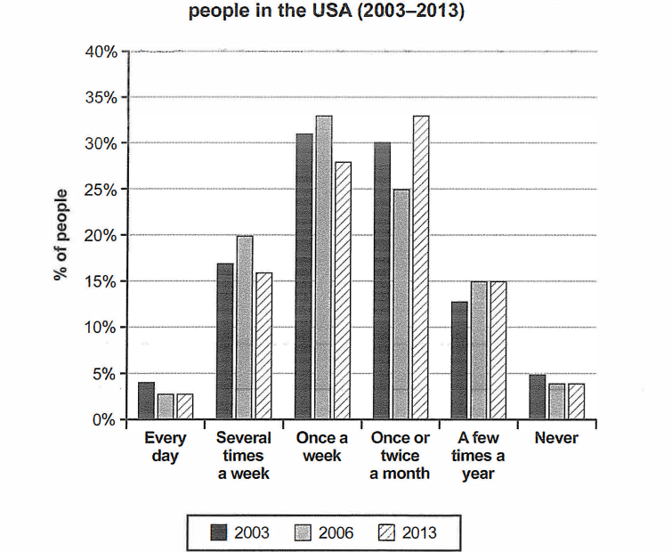
The chart below shows how frequently people in the USA ate in fast food restaurants between 2003 and 2013.

The maps below show the centre of a small town called /slip as it is now, and plans for its development.
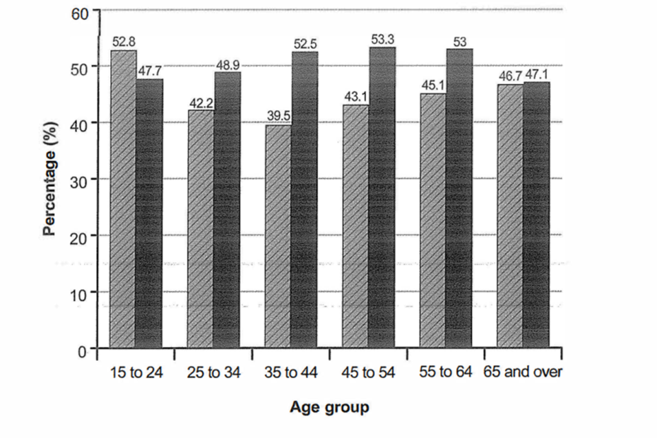
The bar chart below shows the percentage of Australian men and women in different age groups who did regular physical activity in 2010.
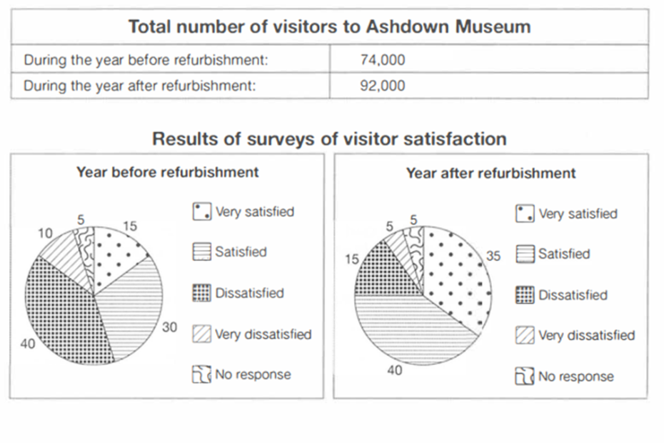
The table below shows the numbers of visitors to Ashdown Museum during the year before and the year after it was refurbished. The charts show the result of surveys asking visitors how satisfied they were with their visit., during the same two periods.
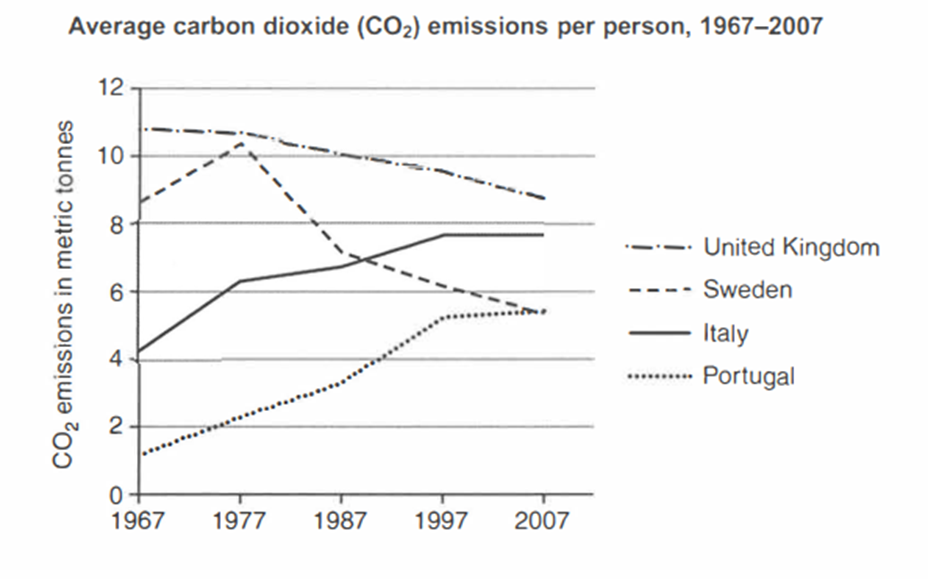
The graph below shows average carbon dioxide (CO2) emissions per person in the United Kingdom, Sweden, Italy and Portugal between 1967 and 2007.