Agricultural land
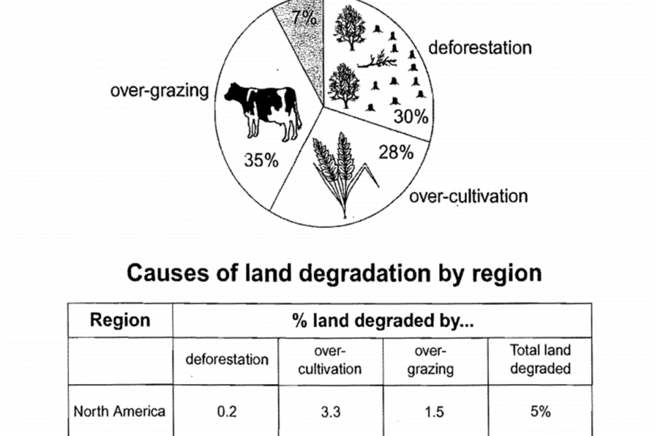
The pie chart below shows the main reasons why agricultural land becomes less productive. The table shows how these causes affected three regions of the world during the 1990s.
The pie chart below shows the main reasons why agricultural land becomes less productive. The table shows how these causes affected three regions of the world during the 1990s.
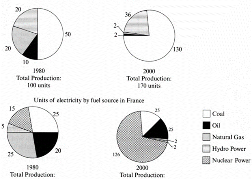
The pie charts below show units of electricity production by fuel source in Australia and France in 1980 and 2000.

The chart below shows information about changes in average house prices in five different cities between 1990 and 2002 compared with the average house prices in 1989.

The charts below give information about USA marriage and divorce rates between 1970 and 2000, and the marital status of adult Americans in two of the years.
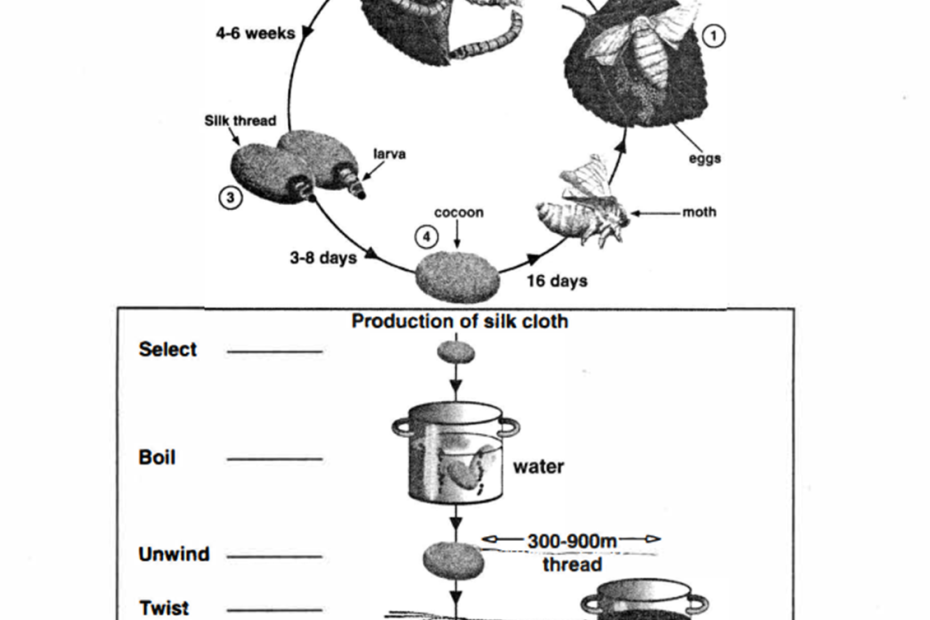
The diagrams below show the lift cycle of the silkworm and stages in the production of silk cloth.
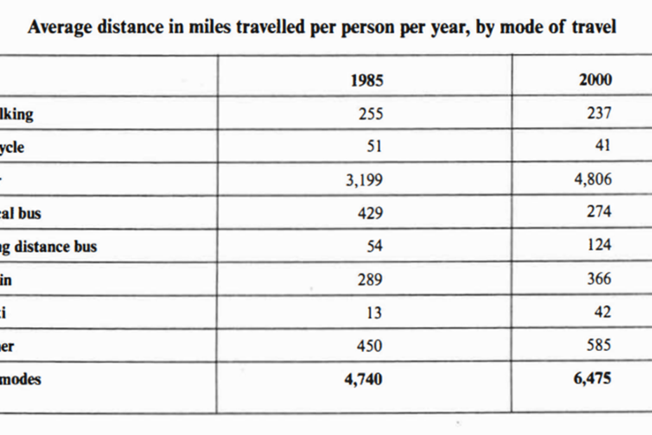
The table below gives information about changes in modes of travel in England between 1985 and 2000.

The graph and table below give information about water use worldwide and water consumption in two different countries.

The map below is of the town of Garlsdon. A new supermarket (S) is planned for the town. The map shows two possible sites for the supermarket.
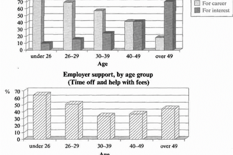
The charts below show the main reasons for study among students of different age groups and the amount of support they received from employers.
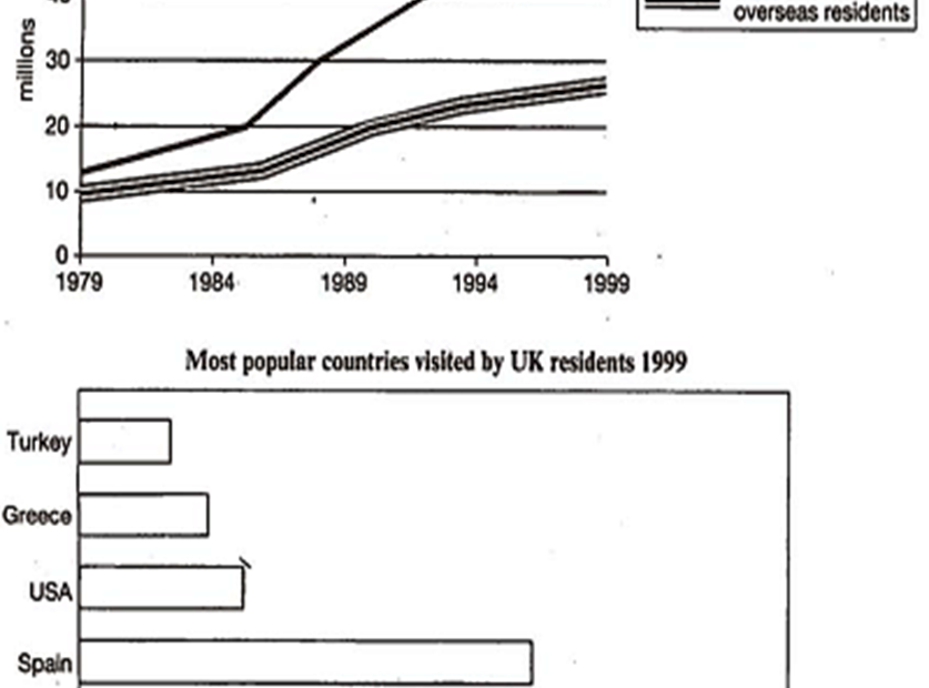
The charts below give information about travel to and from the UK, and about the most popular countries for UK residents to visit.