Demand for and use of electricity
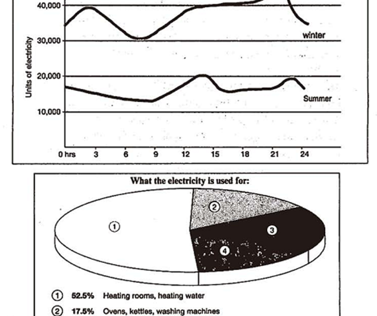
The graph below shows the demand for electricity in England during typical days in winter and summer. The pie chart shows how electricity is used in an average English home.
The graph below shows the demand for electricity in England during typical days in winter and summer. The pie chart shows how electricity is used in an average English home.

The chart below shows the different levels of post-school qualifications in Australia and the proportion of men and women who held them in 1999.

The table shows the percentages of mobile phone owners using various mobile phone features.
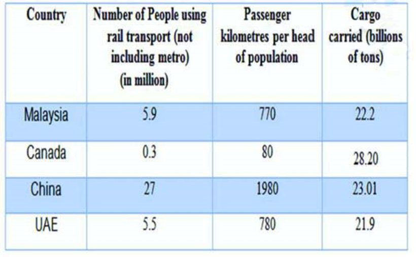
The table below gives information about rail transport in four countries in 2009.
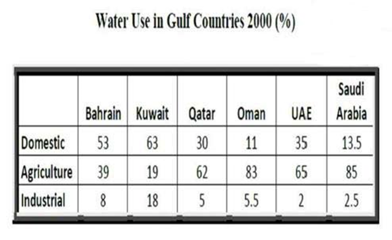
The table below gives information about water use in Gulf Countries in 2000.
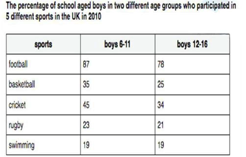
The table below gives information about school aged boys in two different age groups who participated in 5 different sports in the UK in 2010

The table below gives information about the underground railway systems in six cities.
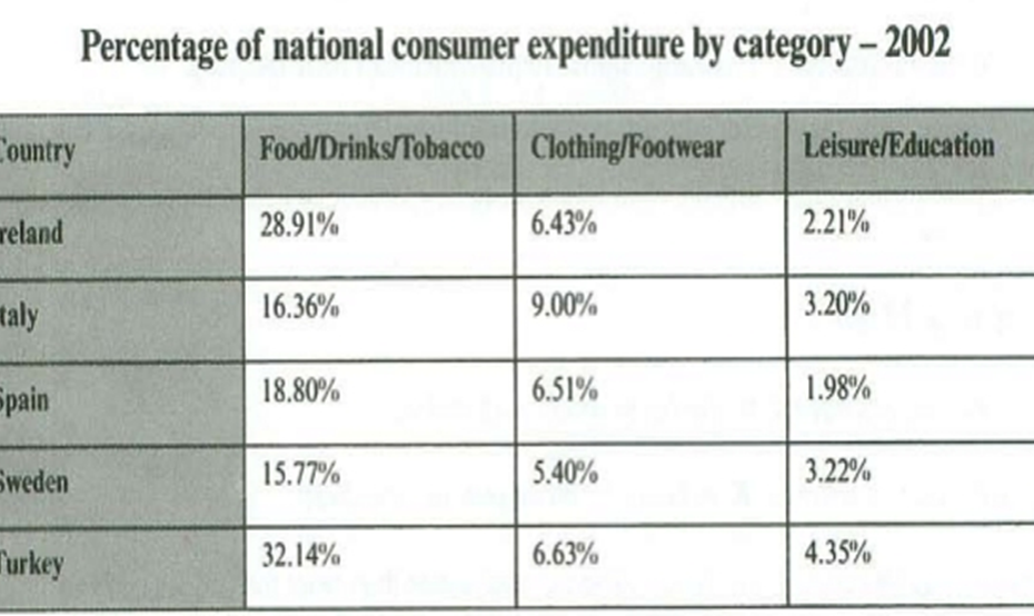
The table below gives information on consumer spending one different items in five different countries in 2002.

The table below shows the proportion of different categories of families living in poverty in Australia in 1999.
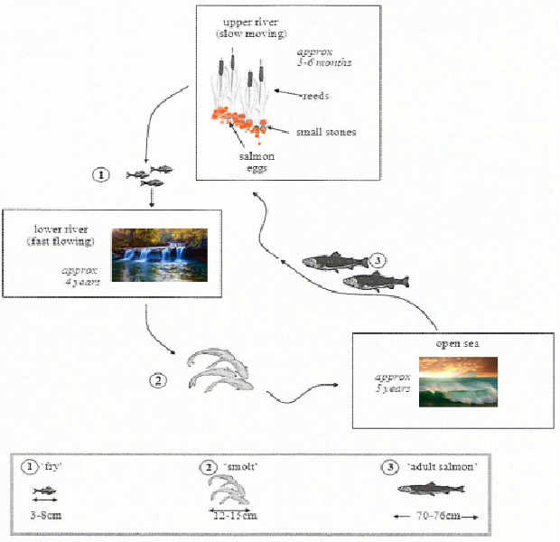
The diagrams below show the life cycle of a species of large fish called the salmon.