People’s coffee and tea buying and drinking habits
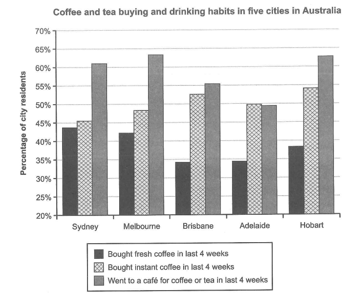
The chart below shows the results of a survey about people’s coffee and tea buying and drinking habits in five Australian cities.
The chart below shows the results of a survey about people’s coffee and tea buying and drinking habits in five Australian cities.
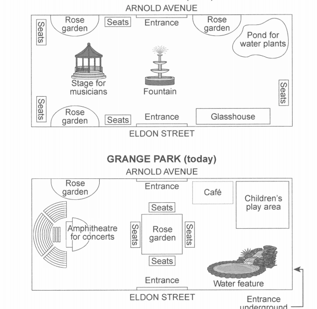
The plans below show a public park when it first opened in 1920 and the same park today.

The diagram below shows how electricity is generated in a hydroelectric power station.
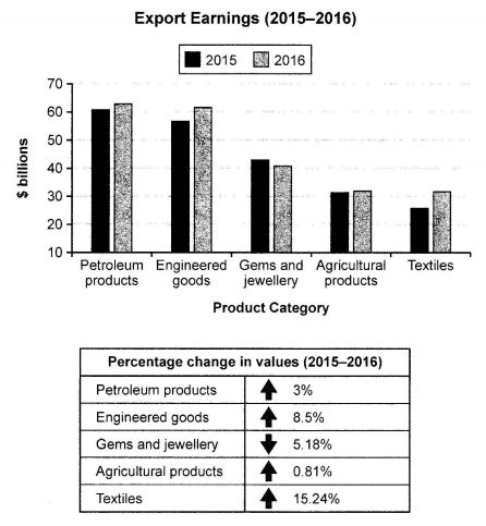
The chart below shows the value of one country’s exports in various categories during 2015 and 2016. The table shows the percentage change in each category of exports in 2016 compared with 2015.
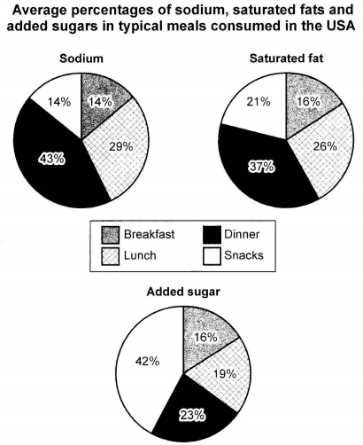
The charts below show the average percentages in typical meals of three types of nutrients, all of which may be unhealthy if eaten too much.

The plans below show the layout of a university’s sports centre now, and how it will look after redevelopment.

The bar chart below shows the top ten countries for the production and consumption of electricity in 2014.
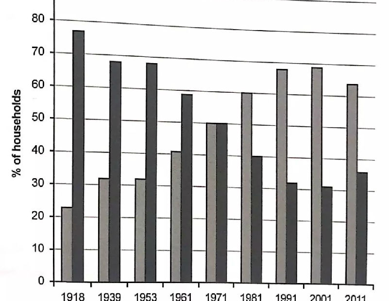
The chart beiow shows the percentage of households in owned and rented accommodation in England and Wales between 1918 and 2011.
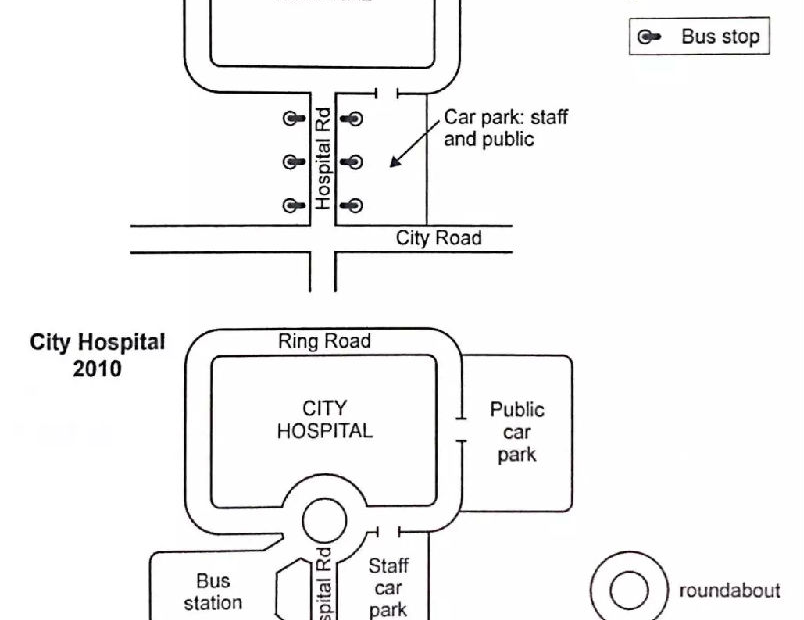
The two maps below show road access to a city hospital in 2007 and in 2010.
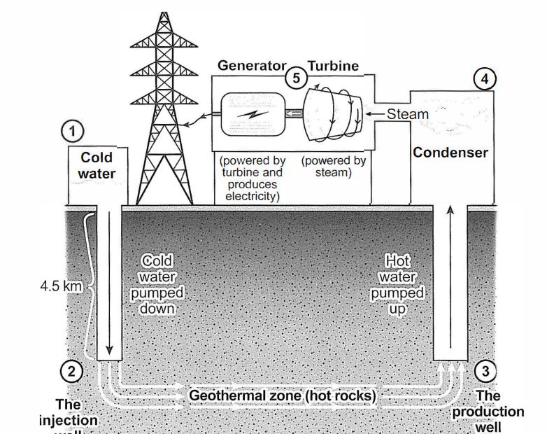
The diagram below shows how geothermal energy is used to produce electricity.