Changes in modes of travel in England
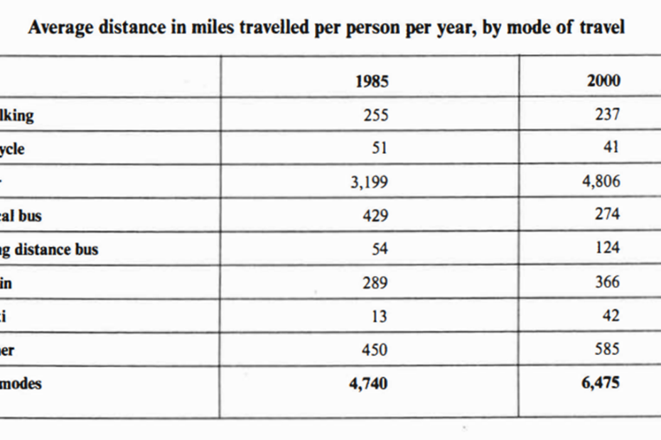
The table below gives information about changes in modes of travel in England between 1985 and 2000.
The table below gives information about changes in modes of travel in England between 1985 and 2000.

The graph and table below give information about water use worldwide and water consumption in two different countries.

The map below is of the town of Garlsdon. A new supermarket (S) is planned for the town. The map shows two possible sites for the supermarket.
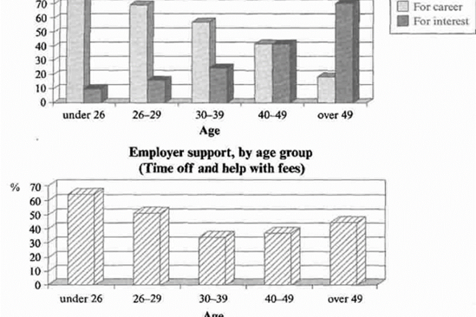
The charts below show the main reasons for study among students of different age groups and the amount of support they received from employers.
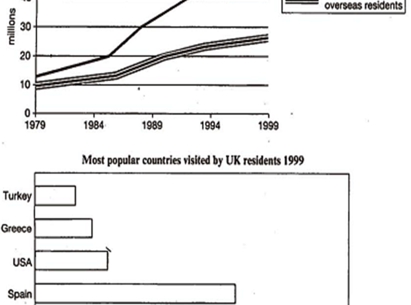
The charts below give information about travel to and from the UK, and about the most popular countries for UK residents to visit.
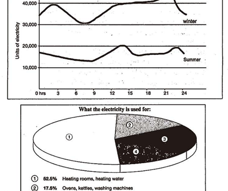
The graph below shows the demand for electricity in England during typical days in winter and summer. The pie chart shows how electricity is used in an average English home.

The chart below shows the different levels of post-school qualifications in Australia and the proportion of men and women who held them in 1999.

The table shows the percentages of mobile phone owners using various mobile phone features.
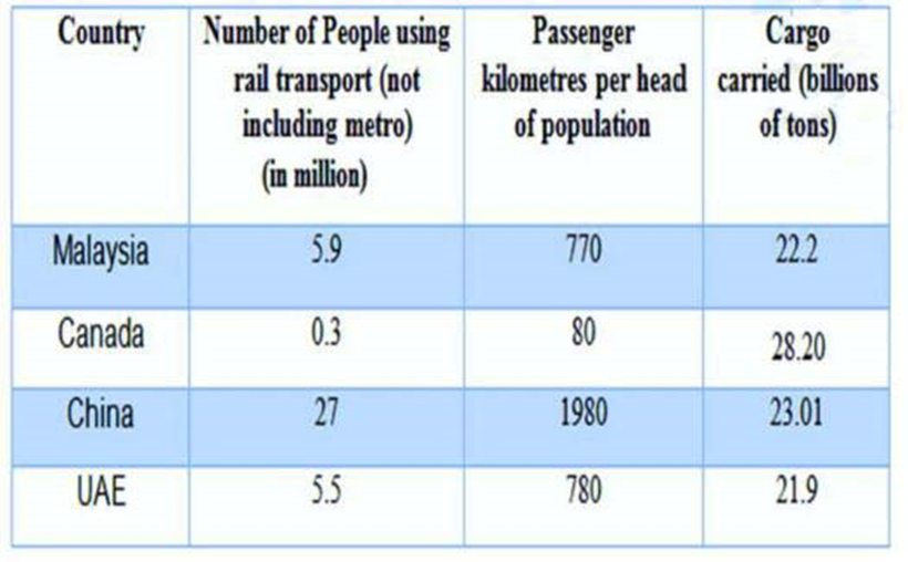
The table below gives information about rail transport in four countries in 2009.
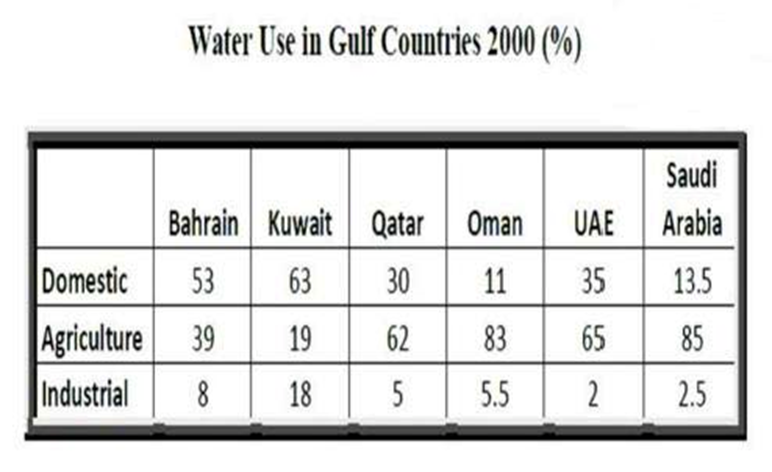
The table below gives information about water use in Gulf Countries in 2000.