School aged boys in two different age groups who participated in 5 different sports
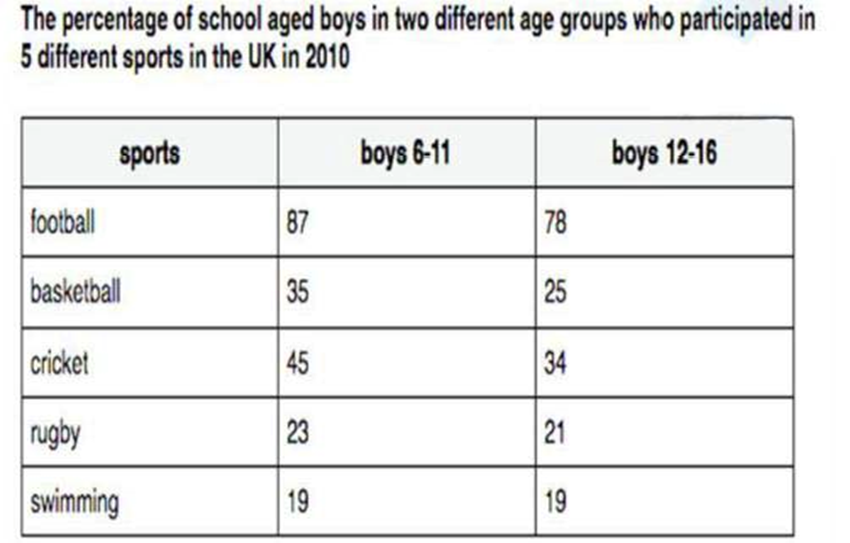
The table below gives information about school aged boys in two different age groups who participated in 5 different sports in the UK in 2010
The table below gives information about school aged boys in two different age groups who participated in 5 different sports in the UK in 2010

The table below gives information about the underground railway systems in six cities.
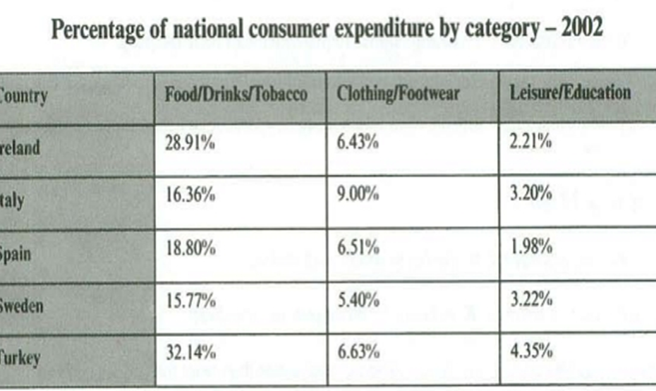
The table below gives information on consumer spending one different items in five different countries in 2002.

The table below shows the proportion of different categories of families living in poverty in Australia in 1999.
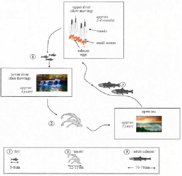
The diagrams below show the life cycle of a species of large fish called the salmon.
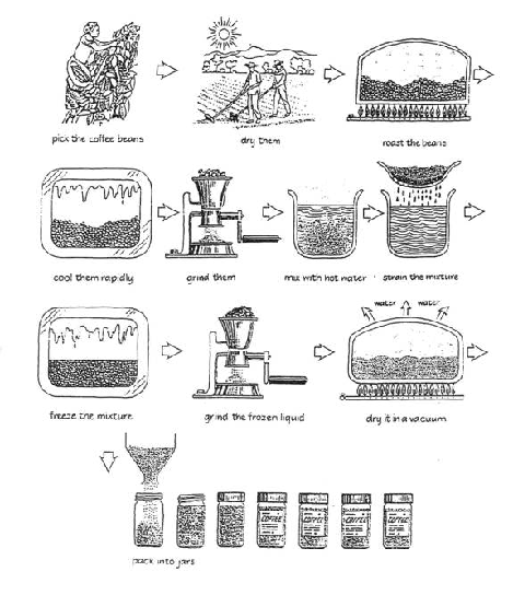
The diagram below shows how coffee is produced and prepared for sale in supermarkets and shops.
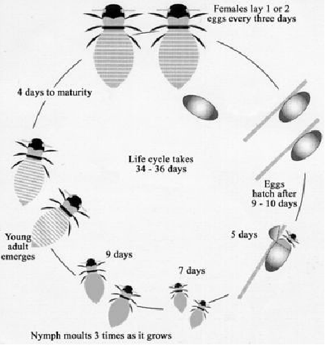
The diagram below shows the life cycle of the honey bee.

The three pie charts below show the changes in annual spending by a particular UK school in 1981, 1991 and 2001.
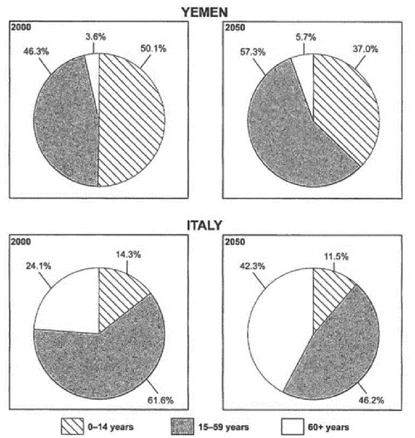
The charts below give information on the ages of the populations of Yemen and Italy in 2000 and projections for 2050.
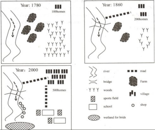
The diagram below shows the development of the village of Kelsby between 1780 and 2000.